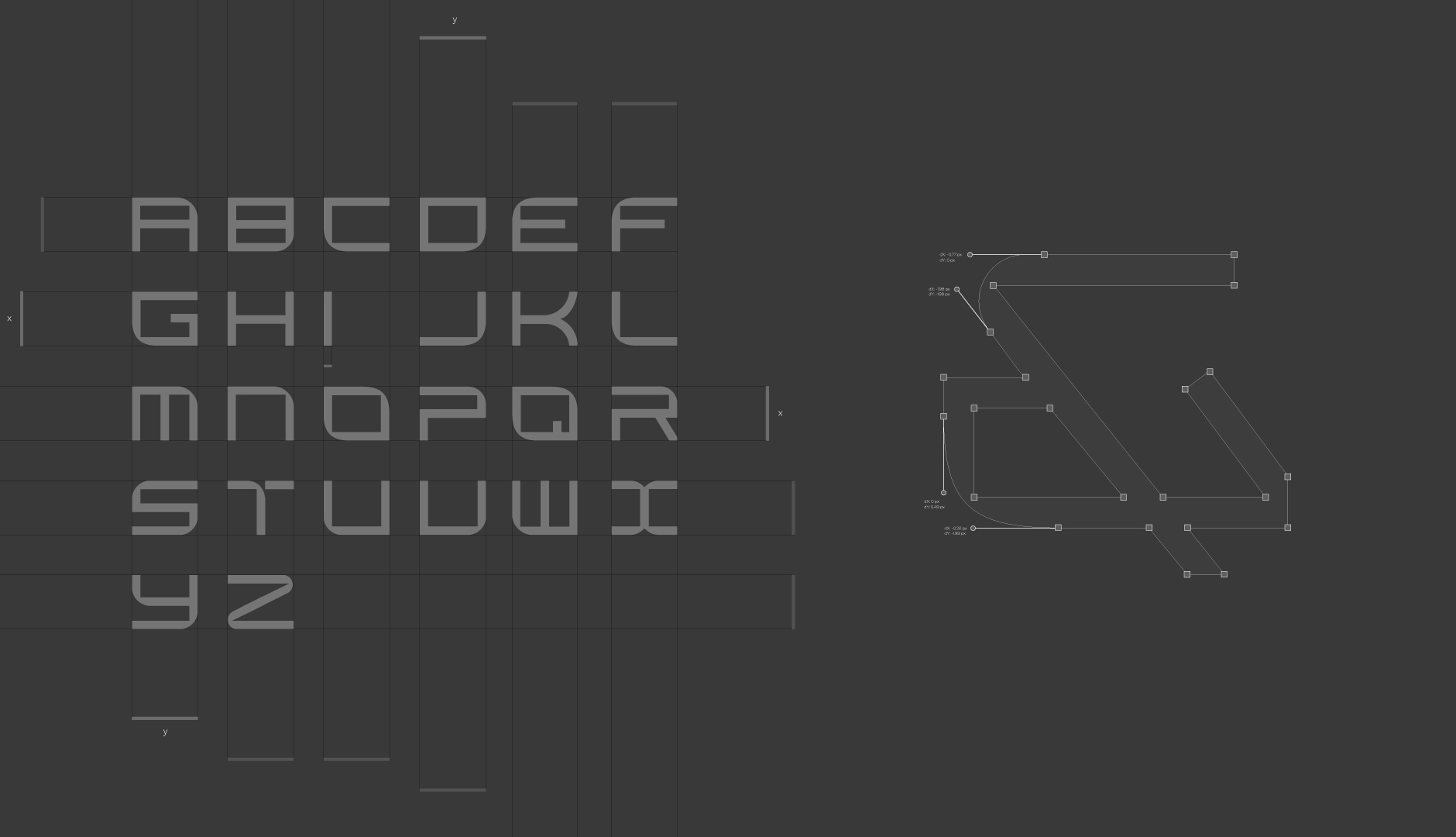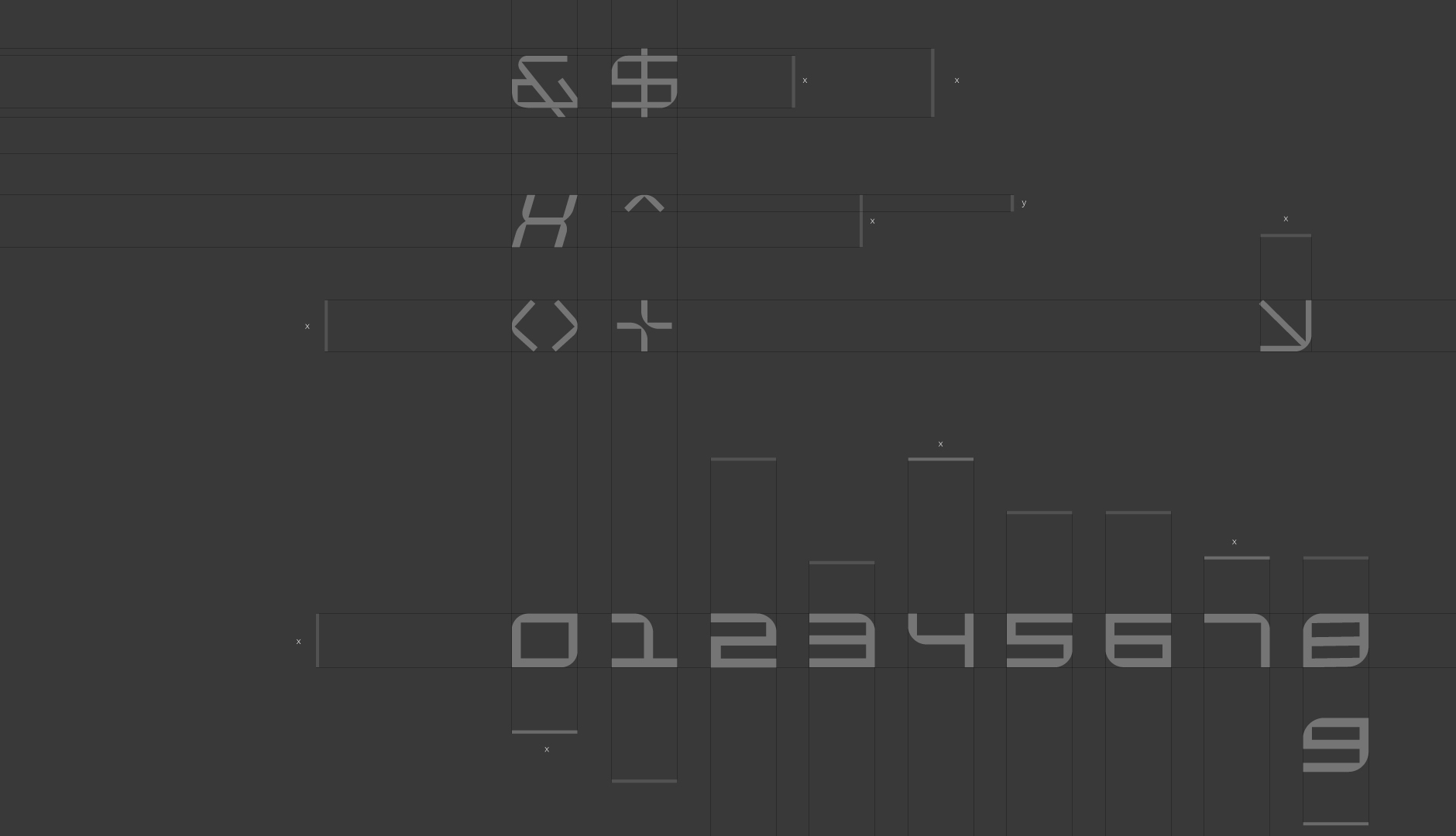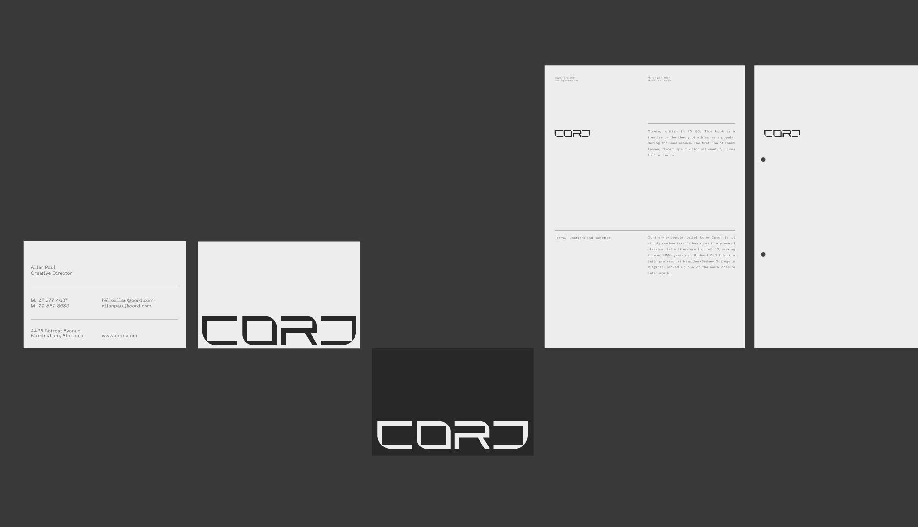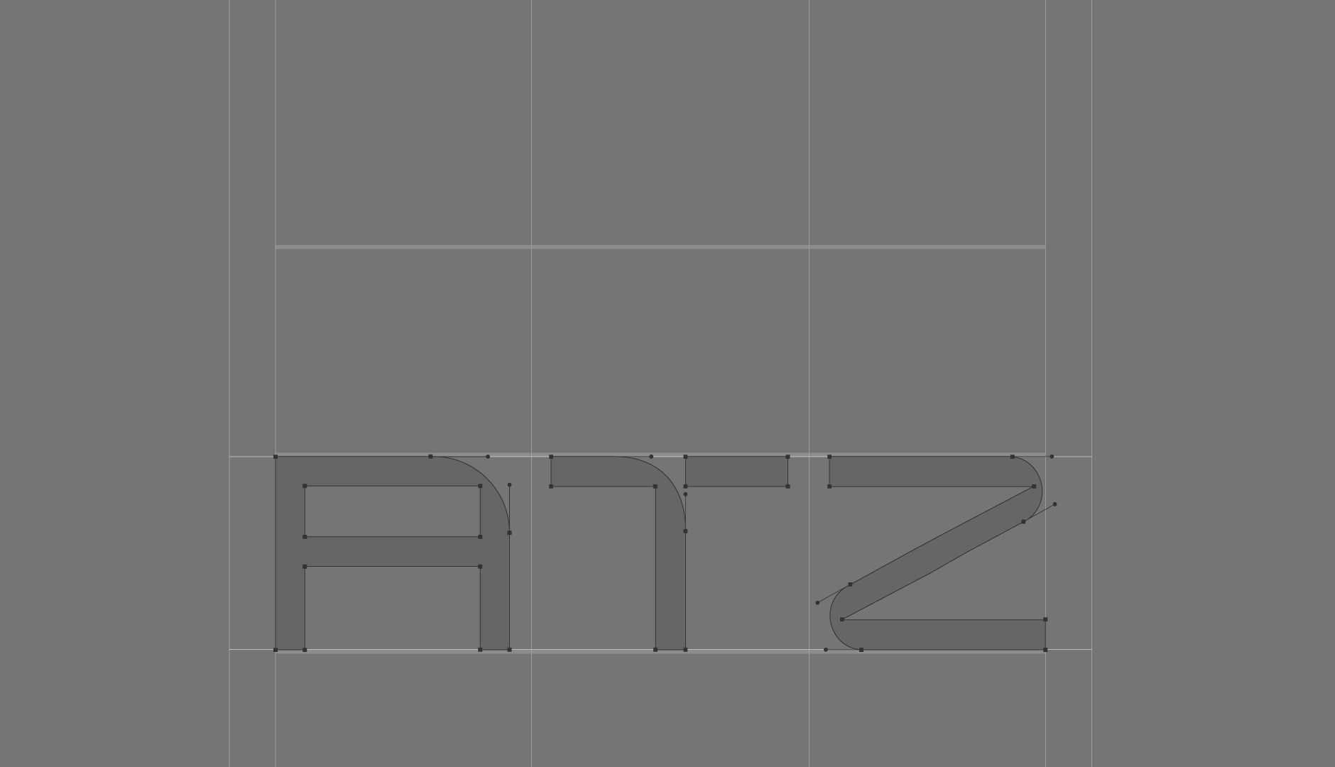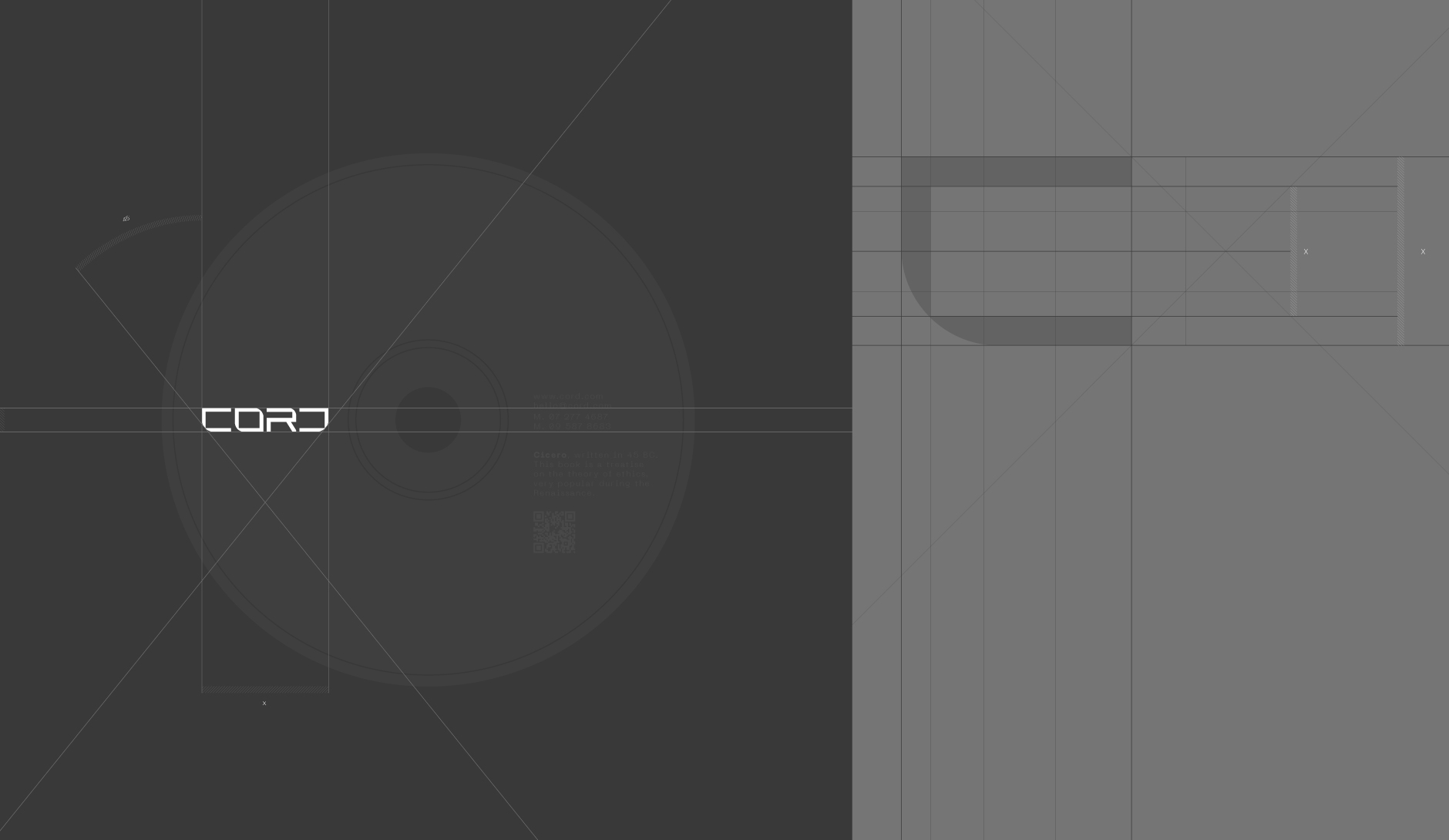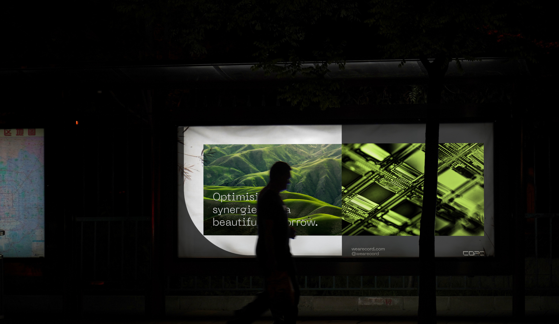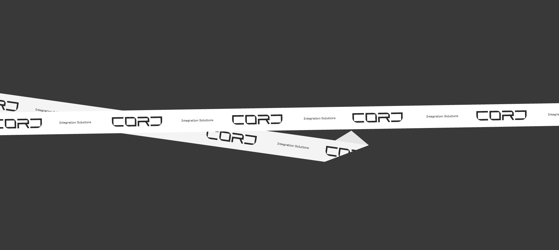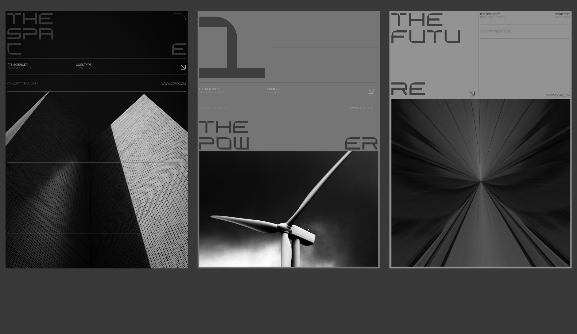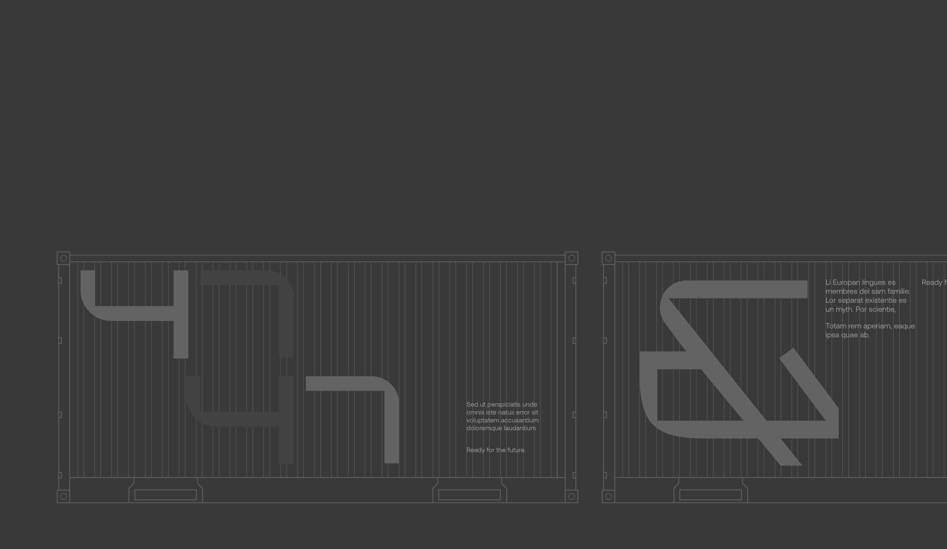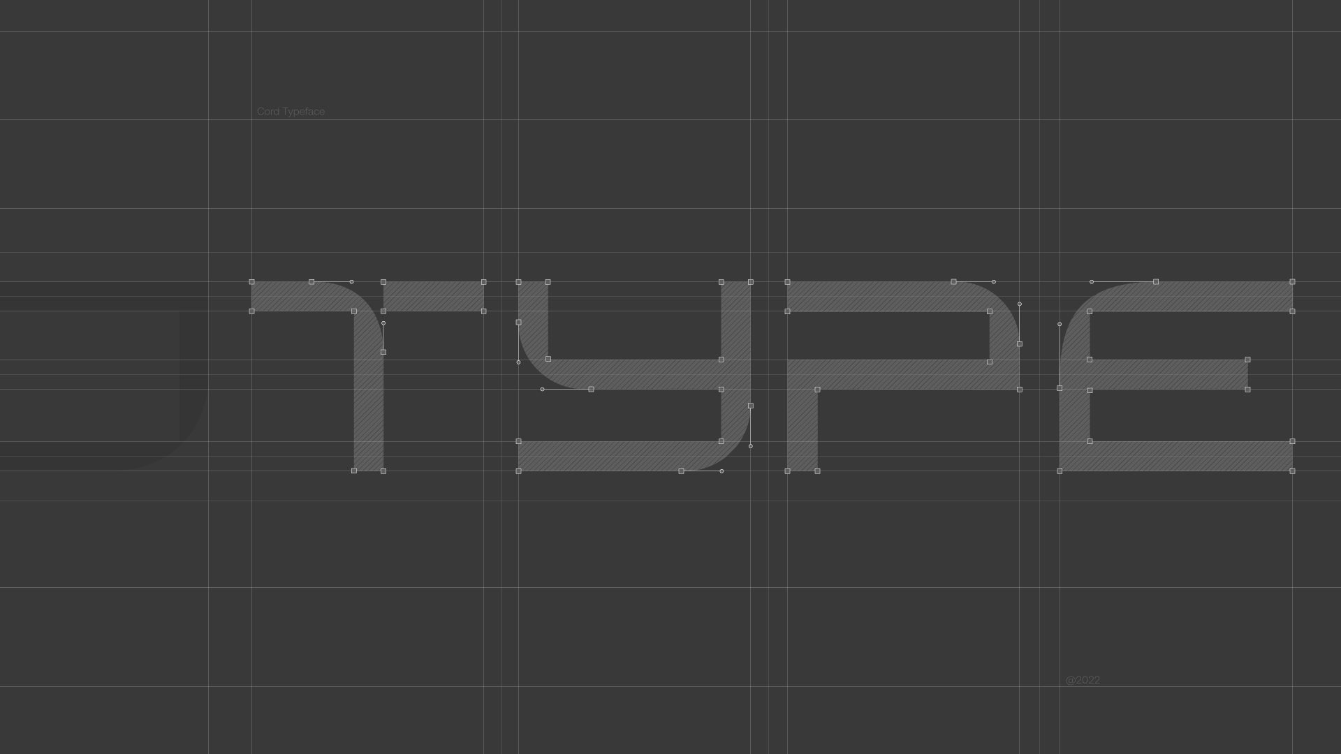

In line with CORD’s brand narrative, a custom typeface was meticulously crafted to visually convey its core values and services. The design of the glyphs is sharp and modern, reflecting the cutting-edge nature of CORD’s technological solutions.
The CORD Typeface is characterised by its clever use of negative space, creating a sense of openness and homogeneity. This design approach allows each letter to seamlessly assimilate with the others, symbolising CORD’s commitment to integration services.
The glyphs are intentionally constructed to represent the brand’s identity - each letter working in harmony, mirroring CORD’s vision of simplifying complex technological challenges through seamless integration.

