ScryAI is not another new‑age AI startup. It is a decades‑old pioneer in enterprise AI, already trusted by global banks, insurers and large enterprises. The task was to craft a mature presence that set ScryAI apart from the crowded field of emergent AI brands, without veering into anything that is limiting and conventional.
Design too close to what resonates today, and the brand risks blending into the queue of emerging AI players. Design too far in the direction of “maturity,” and it can slip into something dated, creating real marketing limitations for a company that must signal itself as a beacon of the future.
Hence we designing the new identity for ScryAI that is mature yet not conventional, seasoned yet not derivative.
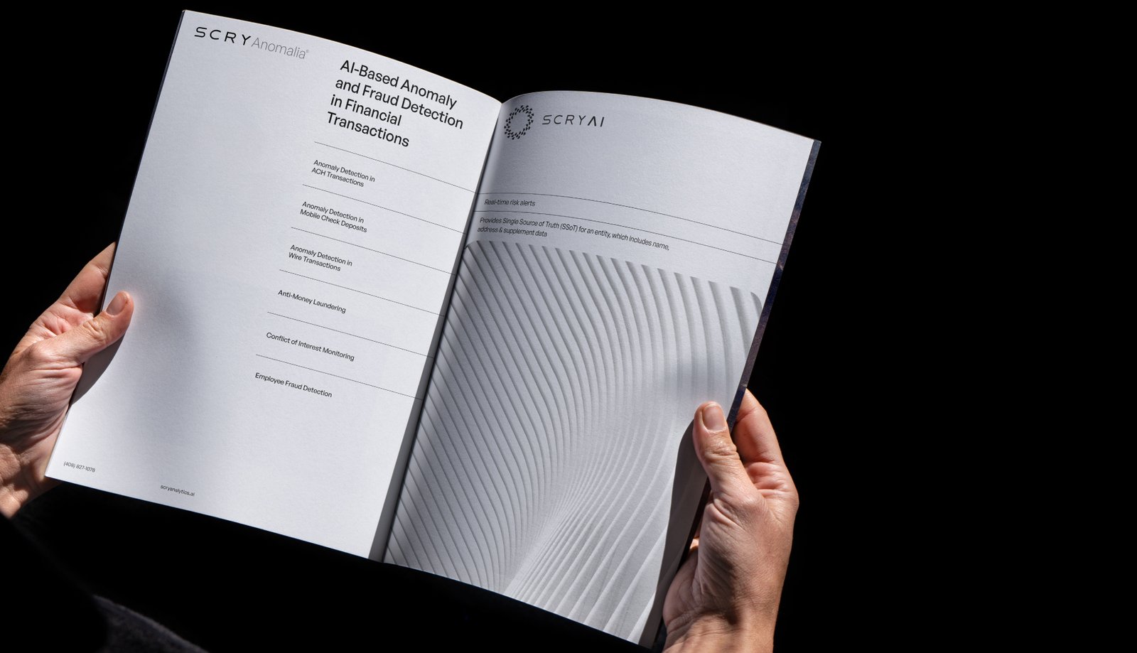
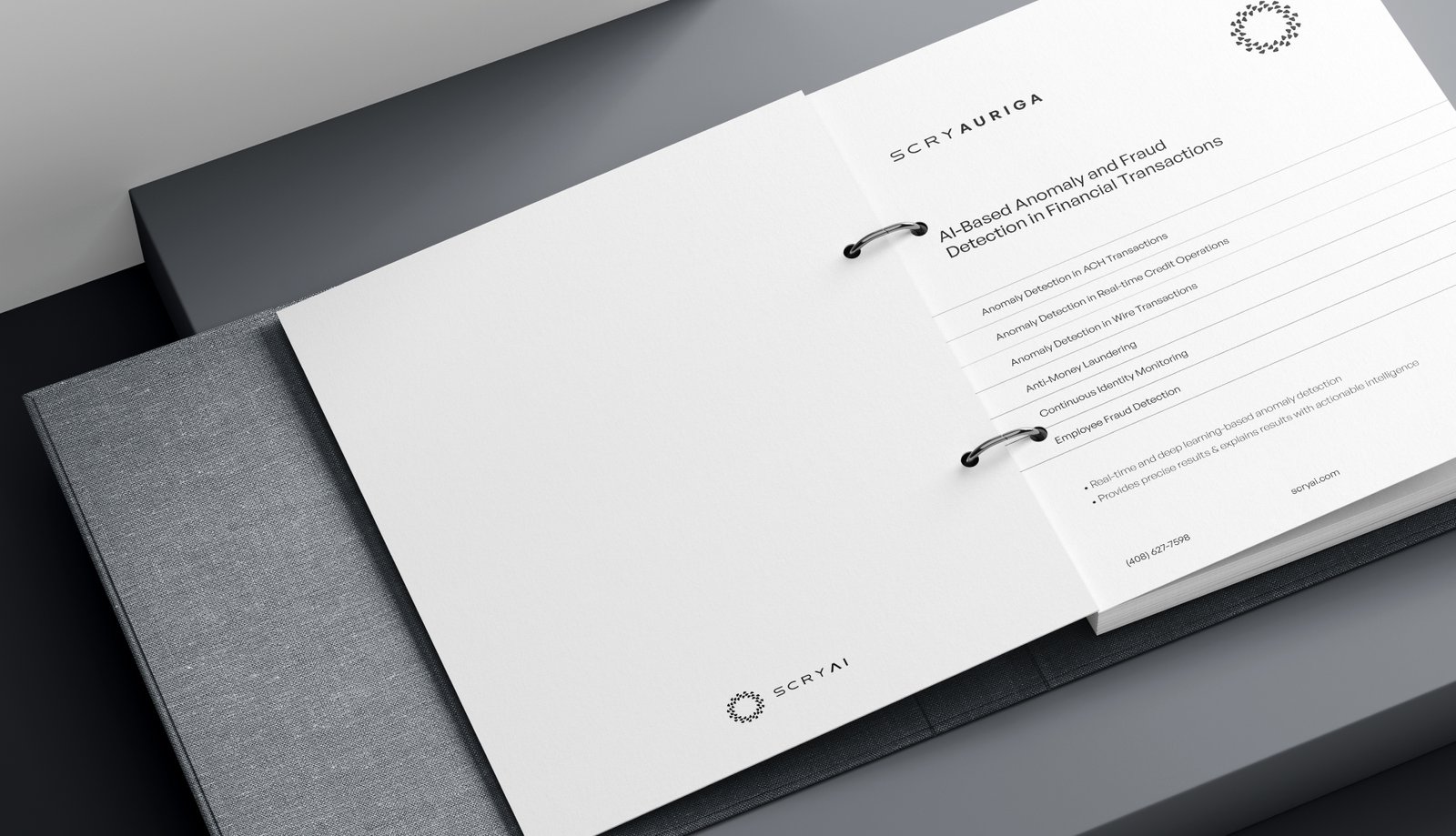
The strategy began with reframing ScryAI’s story: from “an AI company” to “an enterprise‑grade intelligence partner that has been building AI long before it was a buzzword.” We anchored the visual and verbal language around what ScryAI actually does best—turning complex, fragmented data streams into clear, verifiable intelligence that powers decisions in finance, operations and IoT.
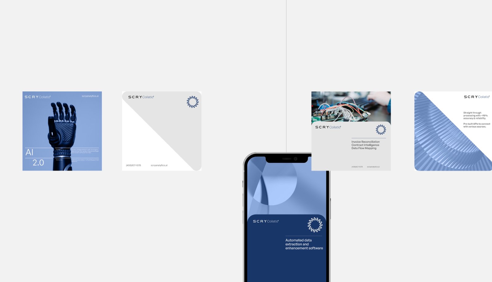
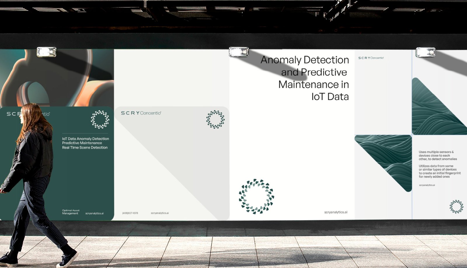
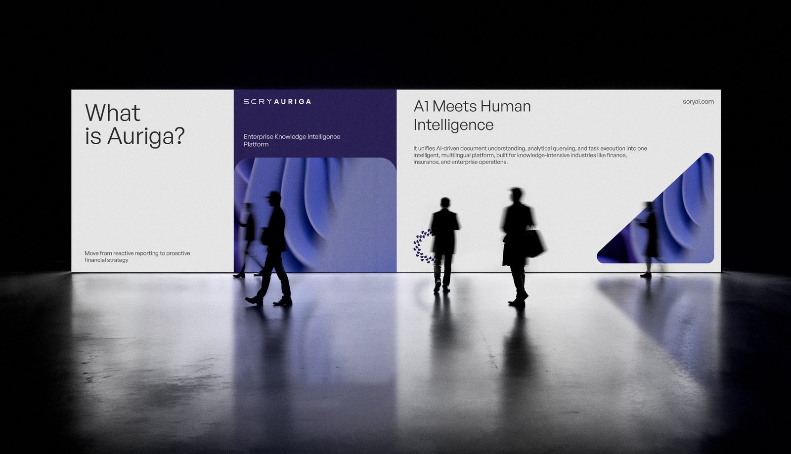
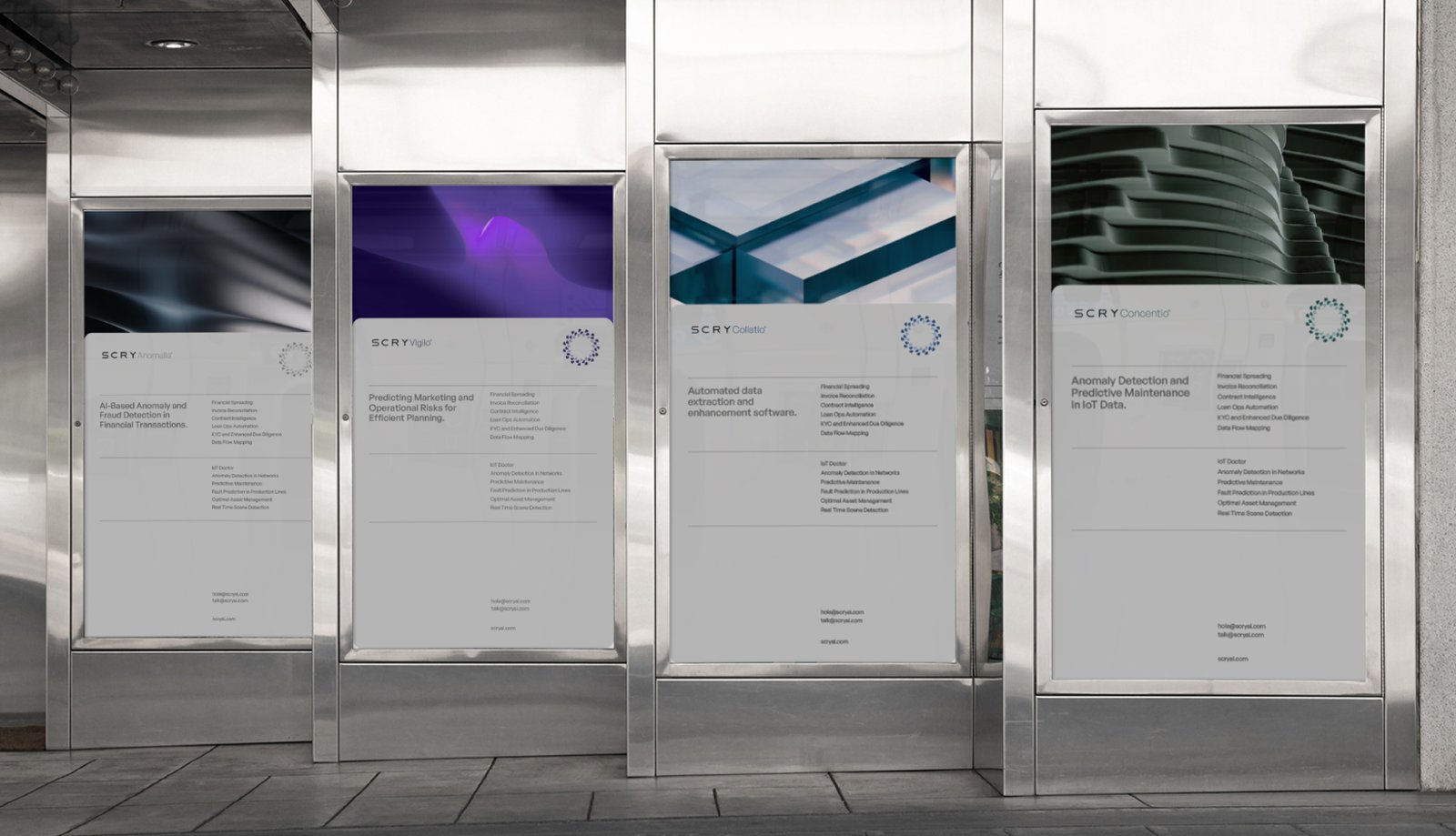
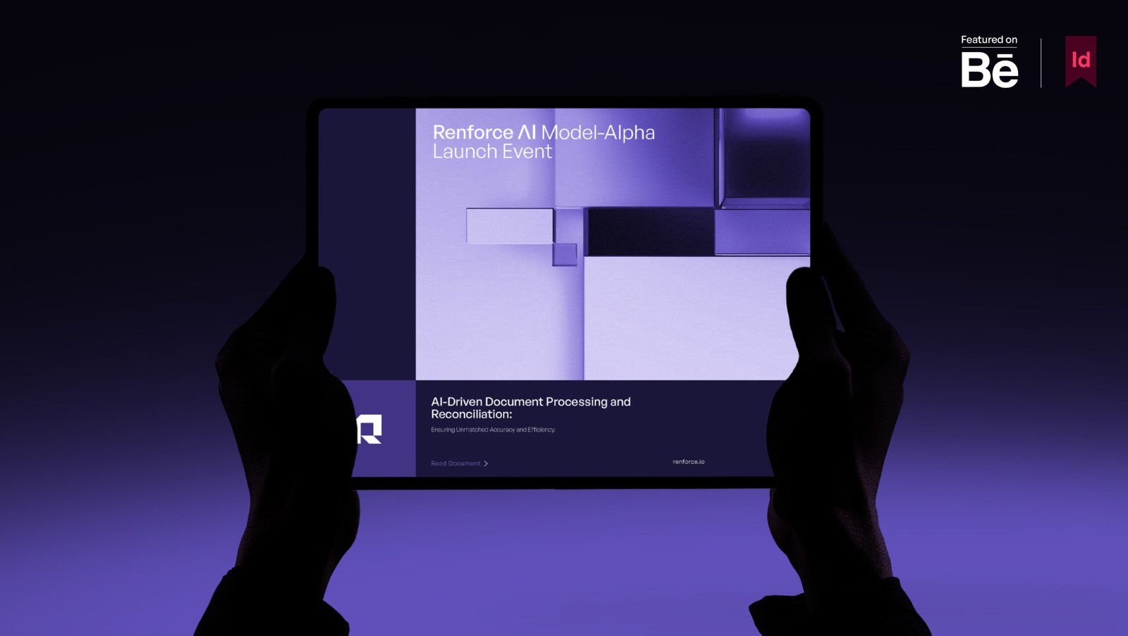
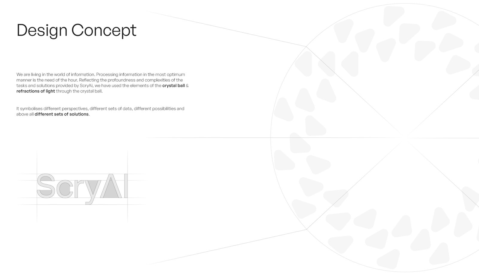
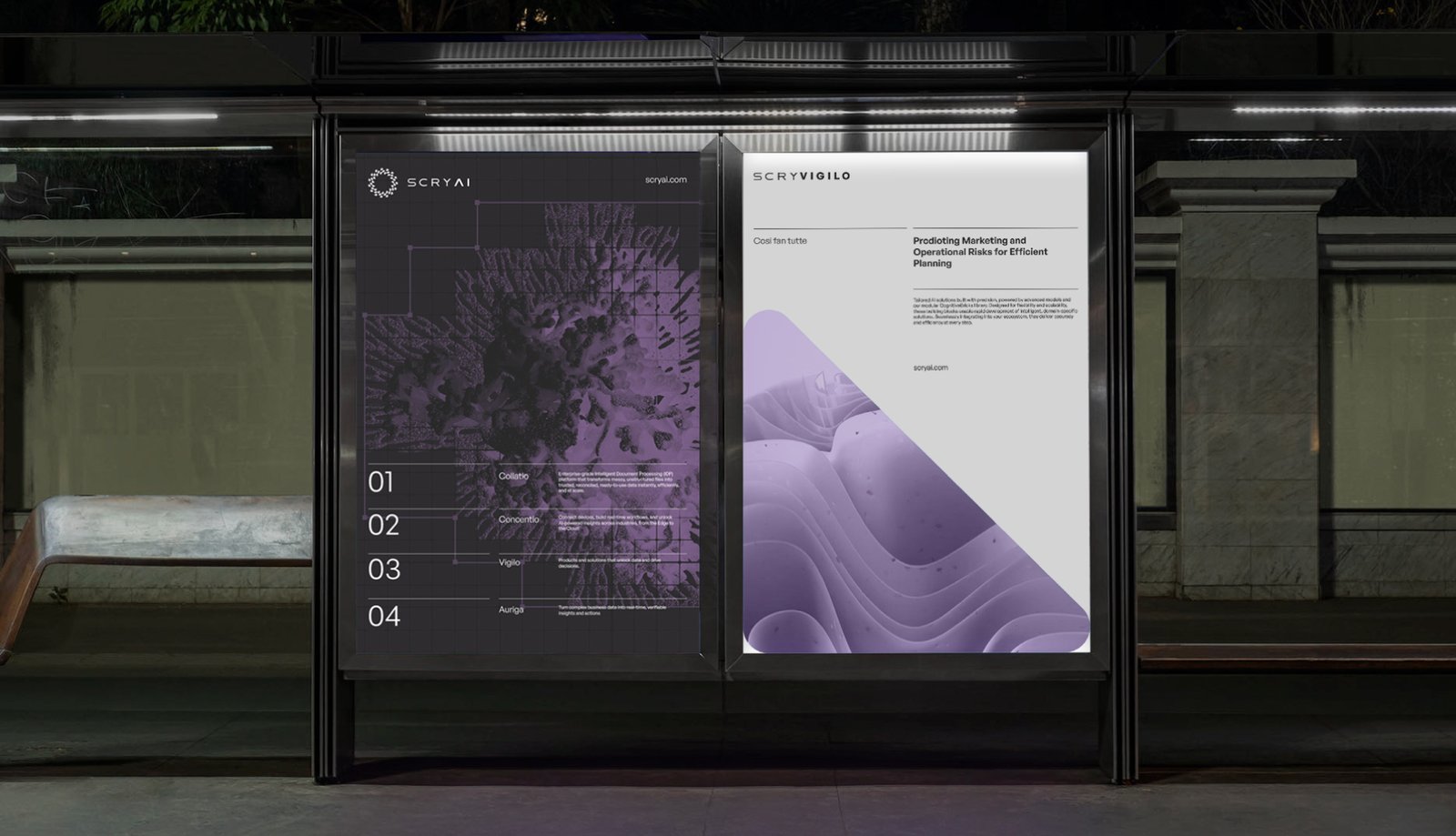
Conceptually, we drew from the idea of “scrying” and the metaphor of a crystal ball—using refractions of light as a way to depict multiple perspectives, varied data inputs and possible futures converging into one sharp insight. This allowed the brand to feel layered and sophisticated, yet clean and contemporary. Structurally, the system was designed to work across ScryAI’s suite of platforms and solutions, creating a unified yet flexible brand architecture.
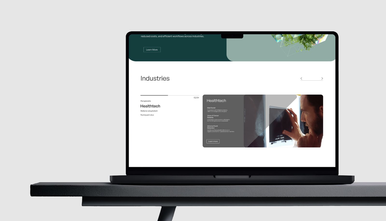
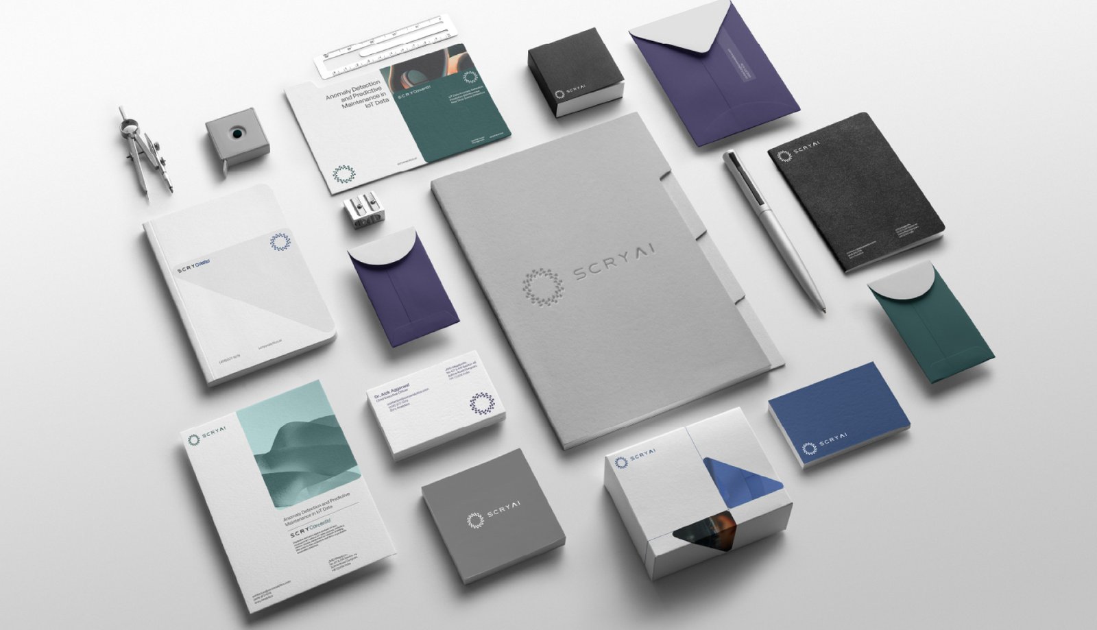
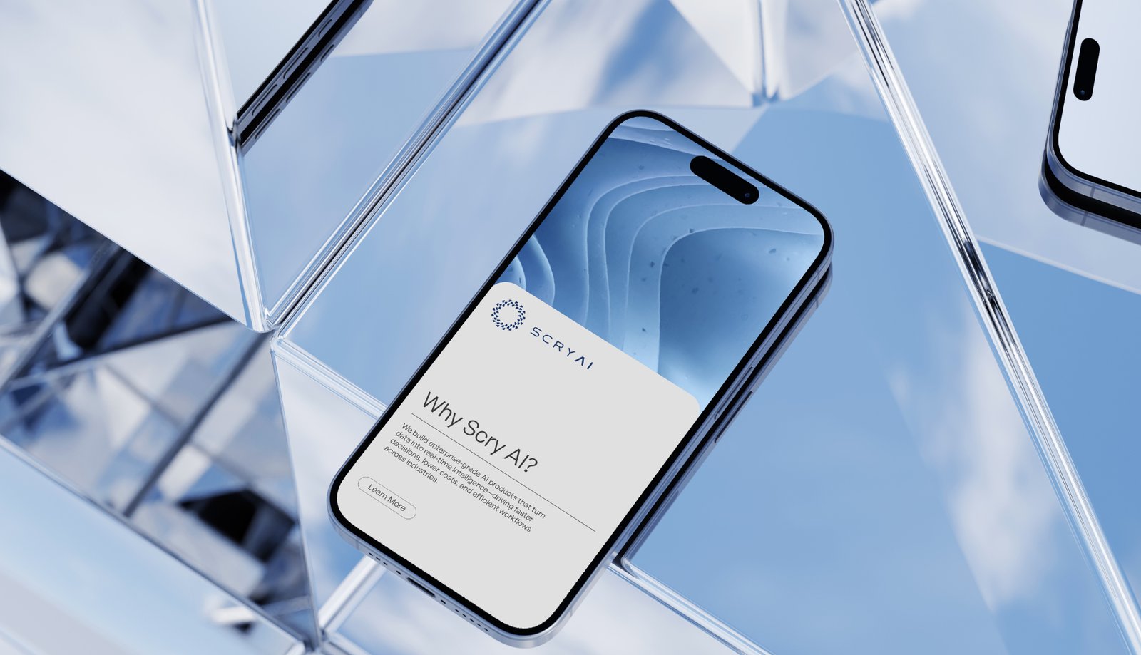
The visual language balances the legacy of experience, simplicity and sense of innovation. These are activated through refraction‑inspired gradients, light orbs and layered compositions that echo data flows, anomaly patterns and shifting viewpoints—subtle cues that signal “AI” without resorting to overused tech design clichés.”