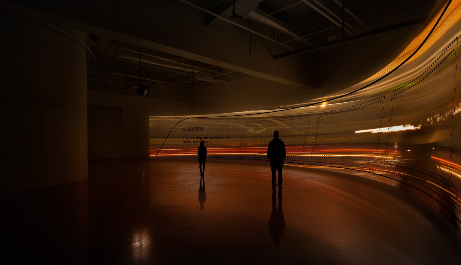
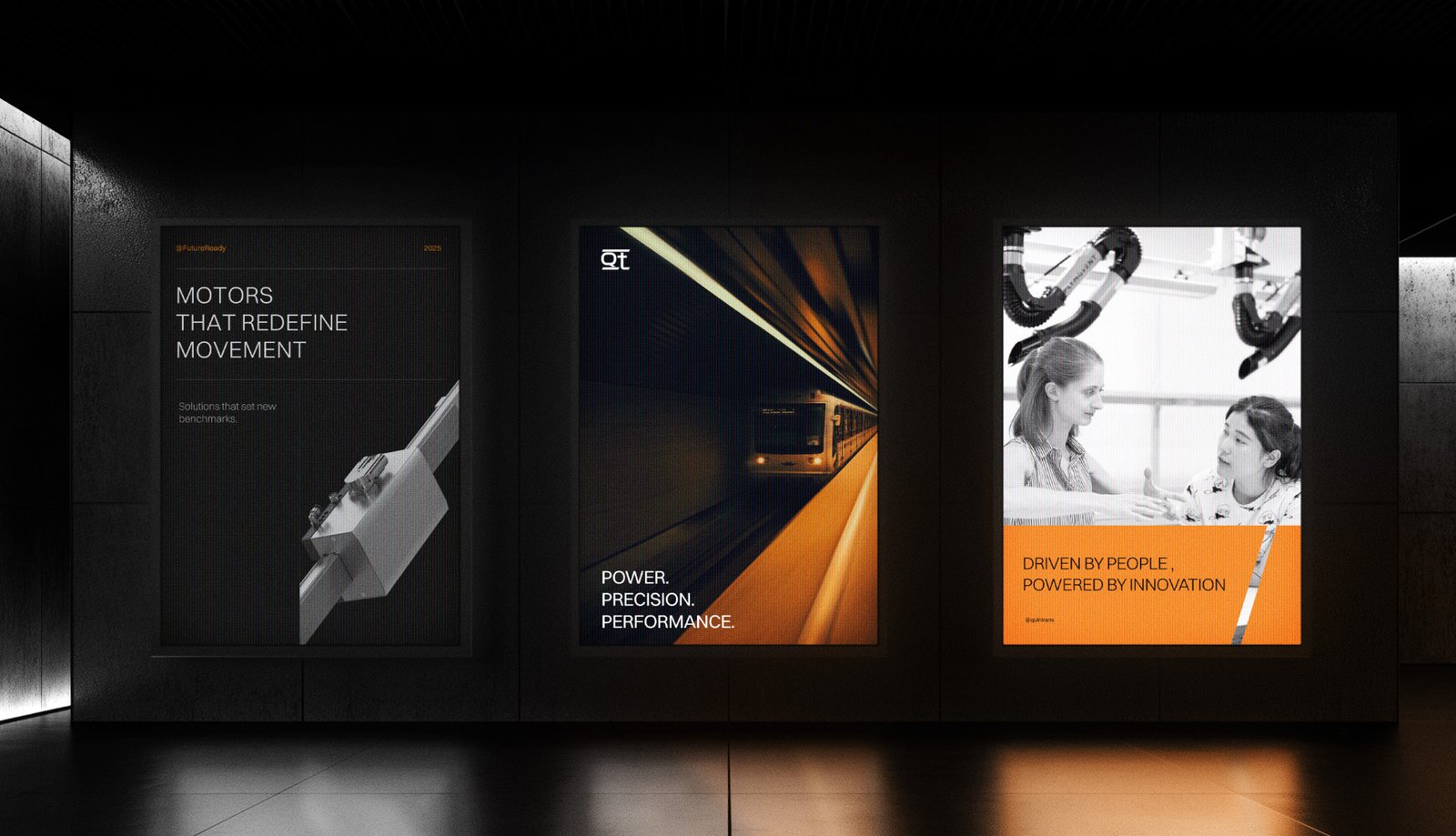
Quintrans is a cutting-edge engineering firm at the forefront of hyper-speed transportation technologies, delivering next-generation motors and software solutions for hyperloop and advanced transit systems. With a vision to transform mass transit—making it dramatically faster, safer, and more efficient—Quintrans aims to set new global benchmarks for mobility in a world challenged by congestion and conventional road transport limitations.
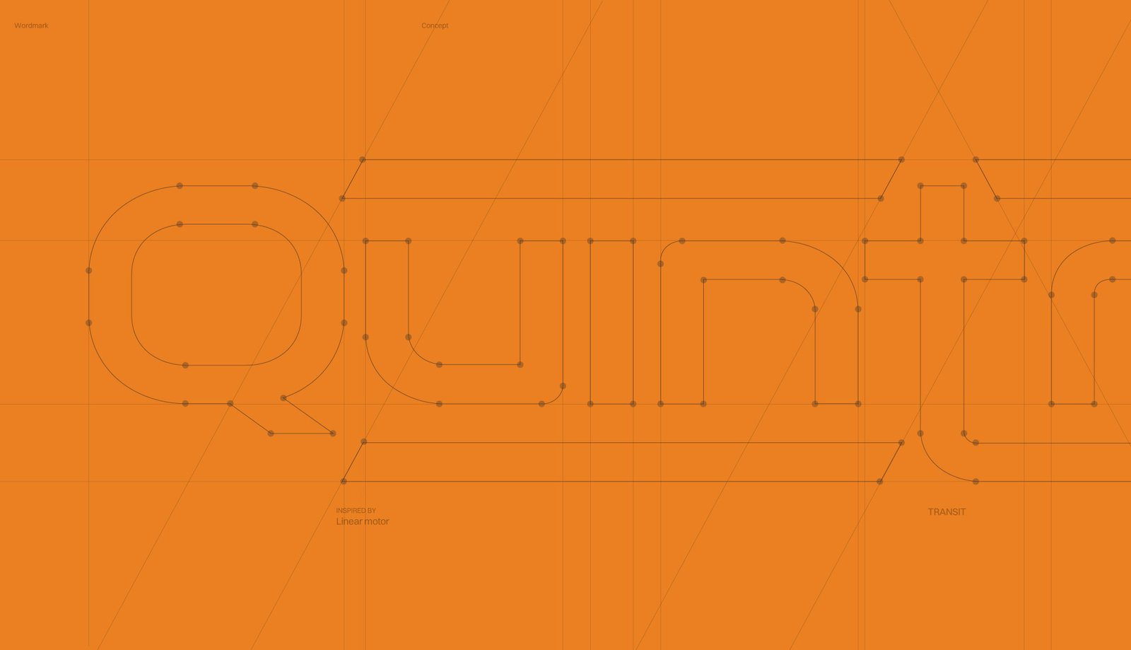
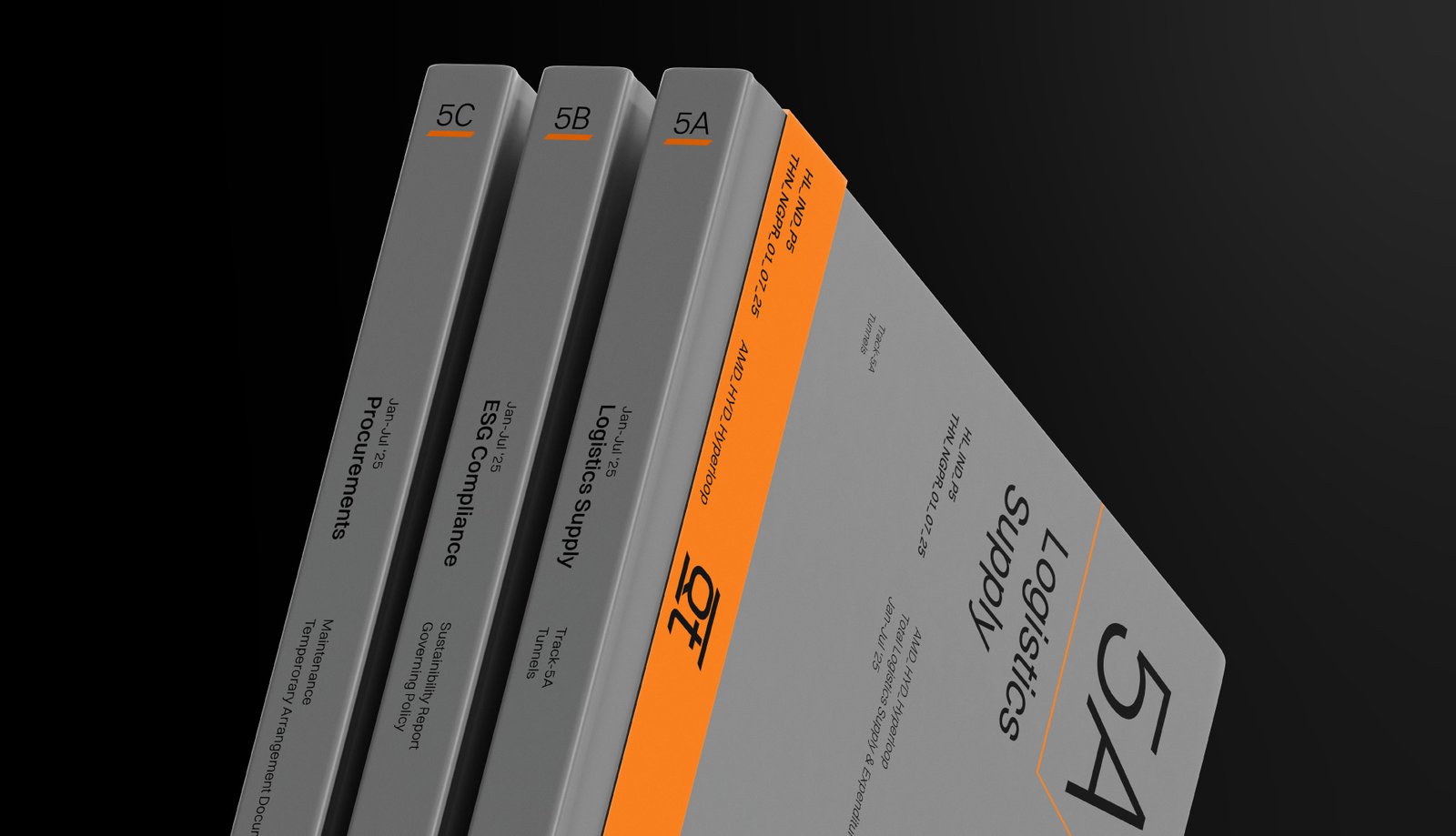
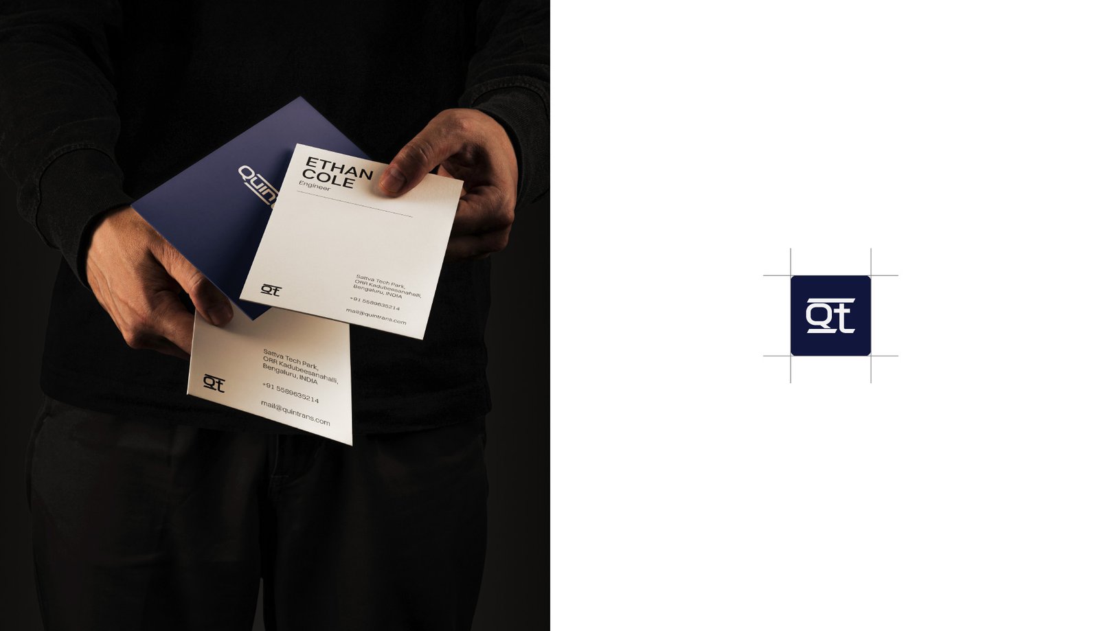
The Quintrans wordmark embodies modern technology and velocity. Each character is designed with precise geometric forms and sharp contours, reflecting the advanced engineering mindset of the brand. The letter forms—structured with angular elements—take cues from transit tracks and linear motors, visually echoing the brand’s technological roots and its drive for seamless, uninterrupted motion.

Motion Blue: Represents speed, adaptability, and the perpetual movement at the heart of Quintrans’ innovations.
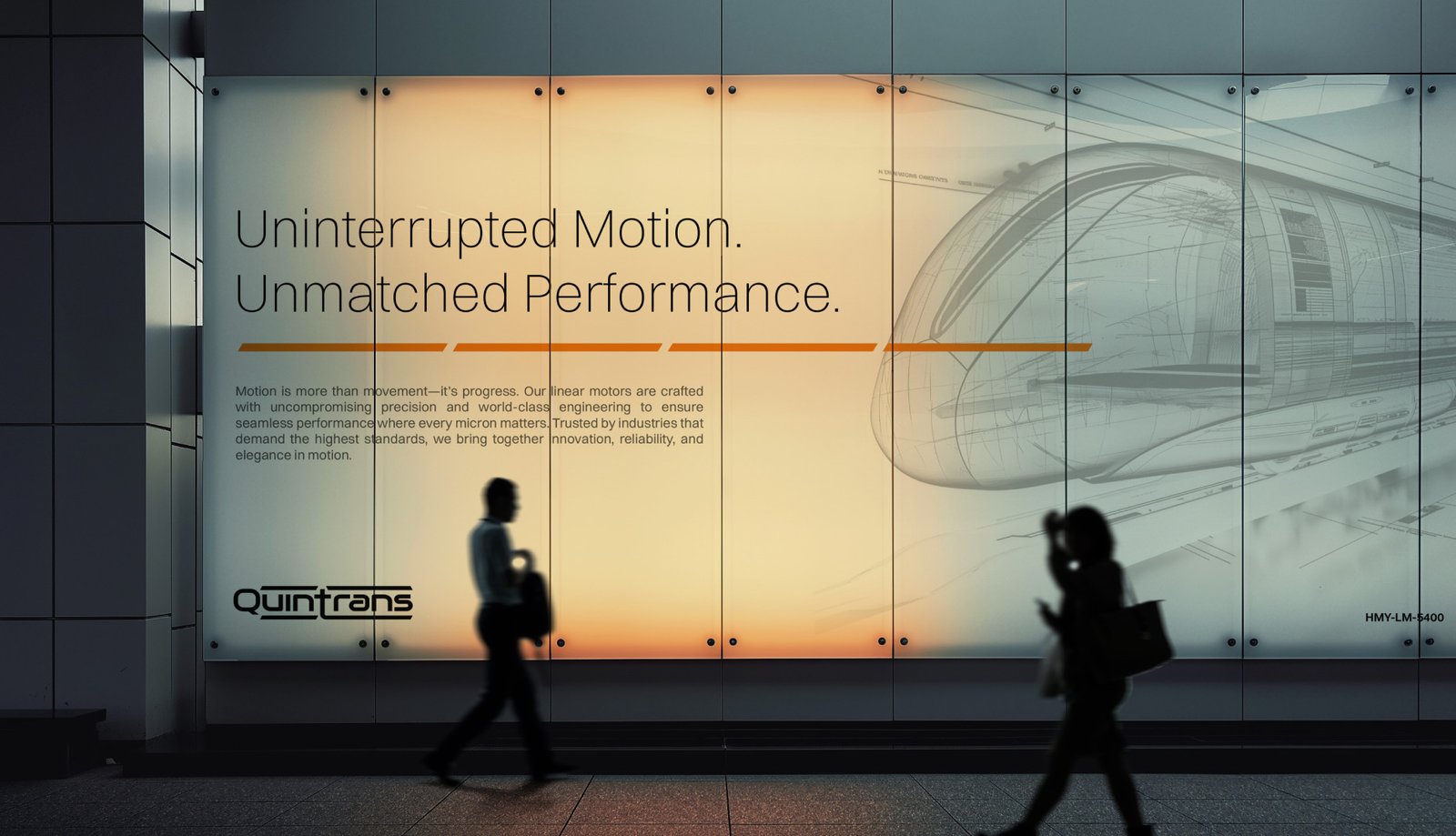
Electric Ember (Orange): Symbolizes harnessed energy, intensity, and the power that drives hyper-speed solutions.
Black: Conveys technological mastery, reliability, and the engineering excellence that underpins all Quintrans products.

Our design philosophy for Quintrans centers on celebrating motion, acting as both a metaphor and a functional element in visual storytelling. Drawing inspiration from the relentless dynamics of speed and movement, we developed a graphic system anchored in the parallelogram—a geometric symbol that intuitively communicates direction, acceleration, and kinetic energy. This motif runs consistently throughout the branding, from the wordmark construction to layout compositions and iconography, reinforcing the idea of forward-thinking progress.